
Articles20 November 2026
Every Photoshop blending mode, one tip each
I just play with the blending mode until I see something that catches my eye.
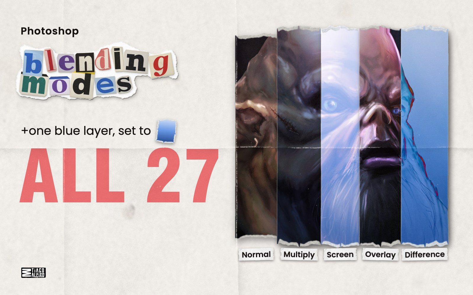
All 27 blending modes in Photoshop’s menu, group by group: what each one does and one tip for using it.
Every example is the same test: one blue layer, light to dark, on top of the painting The Slob. Only the mode changes. Normal and Dissolve are shown at 50% opacity. At 100% the blue covers the painting.
The six groups
- Normal: Normal, Dissolve
- Darken: Darken, Multiply, Color Burn, Linear Burn, Darker Color
- Lighten: Lighten, Screen, Color Dodge, Linear Dodge (Add), Lighter Color
- Contrast: Overlay, Soft Light, Hard Light, Vivid Light, Linear Light, Pin Light, Hard Mix
- Comparative: Difference, Exclusion, Subtract, Divide
- Component: Hue, Saturation, Color, Luminosity
Normal group
Two modes that don’t blend colors at all.
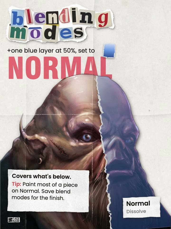
Normal
Covers what’s below. Tip: Paint most of a piece on Normal. Save blend modes for the finish.
Dissolve
Scatters pixels instead of fading them. Tip: Set a soft brush to Dissolve for grainy edges, dust and spray.
Darken group
Every mode here darkens. White does nothing.
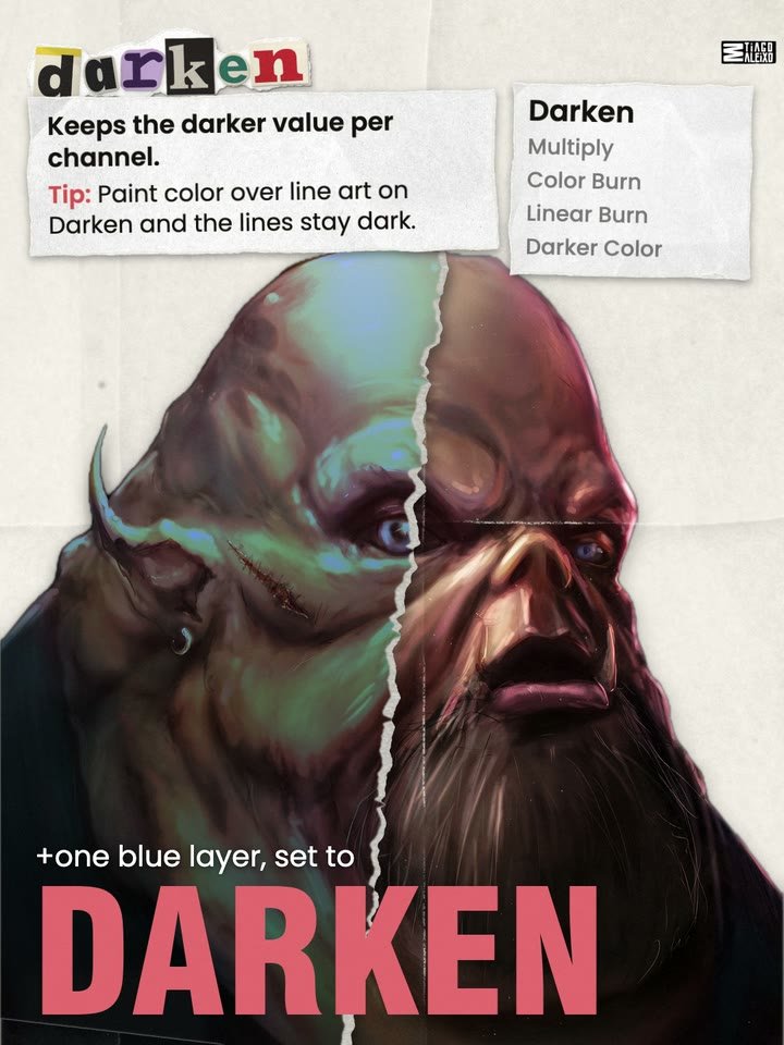
Darken
Keeps the darker value per channel. Tip: Paint color over line art on Darken and the lines stay dark.
Multiply
Darkens everything. White disappears. Tip: Clip a Multiply layer to a color layer to paint its shadows.
I tried probably like four times and I just couldn’t get it. It just didn’t read well. … When I had like five minutes to open it again, I think three days later, it just looked fresh. … That’s when I changed from hard light to multiply. And when I did that, basically the entire piece looked like, oh, this is the starting point. (2026 video)
Color Burn
Darkens with extra contrast and saturation. Tip: Use a soft, low opacity brush for rich shadows. It burns fast.
Linear Burn
Darker than Multiply. The darks fill in fast. Tip: Use it for the deepest shadows, where two forms touch.
Darker Color
Keeps the darker whole color. No new colors. Tip: Dark paint on it only lands on the lighter areas.
Lighten group
Every mode here lightens. Black does nothing.
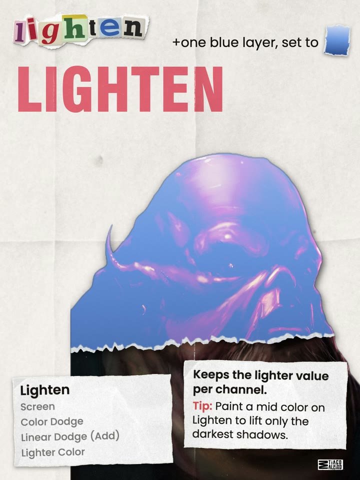
Lighten
Keeps the lighter value per channel. Tip: Paint a mid color on Lighten to lift only the darkest shadows.
Screen
Lightens everything. Black disappears.
Create a new layer, fill it with black, put it on screen, paint it with whatever colors you want and then it’s going to create a glowy effect. (2021 video)
Color Dodge
Brightens and saturates. Very strong.
I usually use color dodge at the end of a piece. … You do little touches of color dodge. Like, if you go crazy, it’s gonna be burned. You don’t want that. (2020 video)
Linear Dodge (Add)
Adds light. Brighter than Screen.
Probably you’ve seen a lot of people use this technique. It’s well known, honestly. Linear dodge, if you have very soft brush, like if you don’t go crazy, it creates a cool glow effect in your work. (2020 video)
Lighter Color
Keeps the lighter whole color. No new colors. Tip: Light paint on it only lands on the darker areas.
Contrast group
Light paint lightens, dark paint darkens. Mid gray does nothing.
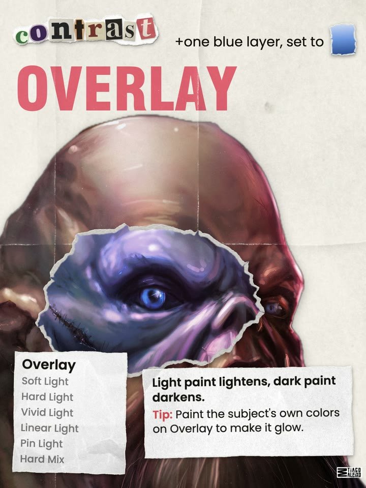
Overlay
Light paint lightens, dark paint darkens.
First thing I usually do is use an overlay layer with the color of the subject. … I use those colors in the overlay layer and paint it over and bam, it looks like they glow. (2019 video)
Soft Light
A gentler Overlay.
I used the purpley blue in soft light and did it at 70 percent, just to make the whole background a bit more nighttime-ish and overall feeling like it belongs. (2018 video)
Hard Light
A harsher Overlay, led by the top layer. Tip: Paint a light color along an edge for rim light.
Vivid Light
Burns with dark paint, dodges with light paint. Tip: Saturated paint at low Fill gives hot light on skin.
Linear Light
Linear Burn with dark paint, Linear Dodge with light. Tip: A mid toned texture at low opacity adds grain.
Pin Light
Light paint replaces darker pixels, dark paint replaces lighter. Tip: On a texture, only specks and scratches come through.
Hard Mix
Pushes every pixel to one of eight flat colors. Tip: To soften it, lower Fill, not Opacity.
Comparative group
These compare the two layers and keep what’s different.
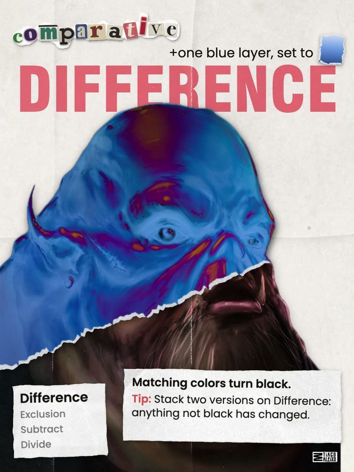
Difference
Matching colors turn black. Tip: Stack two versions on Difference: anything not black has changed.
Exclusion
A softer, lower contrast Difference. Tip: Fill with a dark blue on Exclusion to fade and tint the blacks.
Subtract
Takes the top color away from the bottom. Tip: A very dark blue on Subtract warms the piece.
I just like this subtract one … like more contrast, and I like it. I don’t know. (2018 video)
Divide
Brightens by dividing out the top color. Tip: Yellow scan? Divide by the paper color and it turns white.
Component group
These take one part of the top color: its hue, its saturation or its brightness. Each strip is a new layer in that mode.
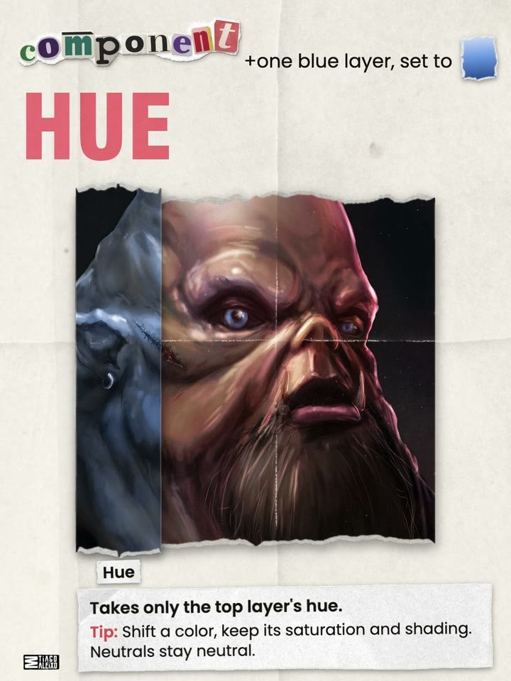
Hue
Takes only the top layer’s hue. Tip: Shift a color, keep its saturation and shading. Neutrals stay neutral.
Saturation
Takes only the top layer’s saturation. Tip: Paint black on Saturation to drain the color from one spot.
Color
Takes hue and saturation. Keeps the values. Tip: Glaze red into the nose and ears without touching the values.
Luminosity
Takes only the top layer’s brightness.
On our adjustment layer I’m going to change the blending mode to luminosity, and that way we don’t really affect the colors, we just affect the values. (2021 video)
Cheat sheet and video
All 27 modes, one per page, as a PDF. The same 27 modes as one video.
Download the PDF (9.5 MB)Watch on YouTube
I will see you next monster.