
Articles29 January 2025
How to Create Eye-Catching Art Thumbnails for Social Media
Your thumbnail is the whole pitch before anyone sees your actual work. Scroll speed on social media is brutal now, and if the thumbnail doesn’t stop the thumb, the art underneath never gets a chance. This is what I actually do to make mine work.
Why this matters more than people think
A thumbnail isn’t decoration, it’s the first three seconds of a pitch. No thumbnail, no click, doesn’t matter how good the piece behind it is. On Instagram, TikTok, YouTube, this is the actual first impression, not your bio, not your caption.
Strong thumbnails do four things at once: stop the scroll, push engagement up, boost click-through rate, and quietly build brand recognition every time someone sees your visual style repeat.
Get the dimensions right first
Wrong size means blurry, cropped, or stretched, and none of the psychology below matters if the image looks broken.
| Platform | Size | Ratio |
|---|---|---|
| YouTube | 1280 x 720 px | 16:9 |
| Instagram Posts | 1080 x 1080 px | 1:1 |
| Instagram Reels | 1080 x 1920 px | 9:16 |
| TikTok | 1080 x 1920 px | 9:16 |
Save at high resolution. A pixelated thumbnail reads as low effort before anyone even processes the image itself.
The psychology, in plain terms
The brain processes images tens of thousands of times faster than text. Your thumbnail has to land before anyone’s consciously reading anything.
Contrast
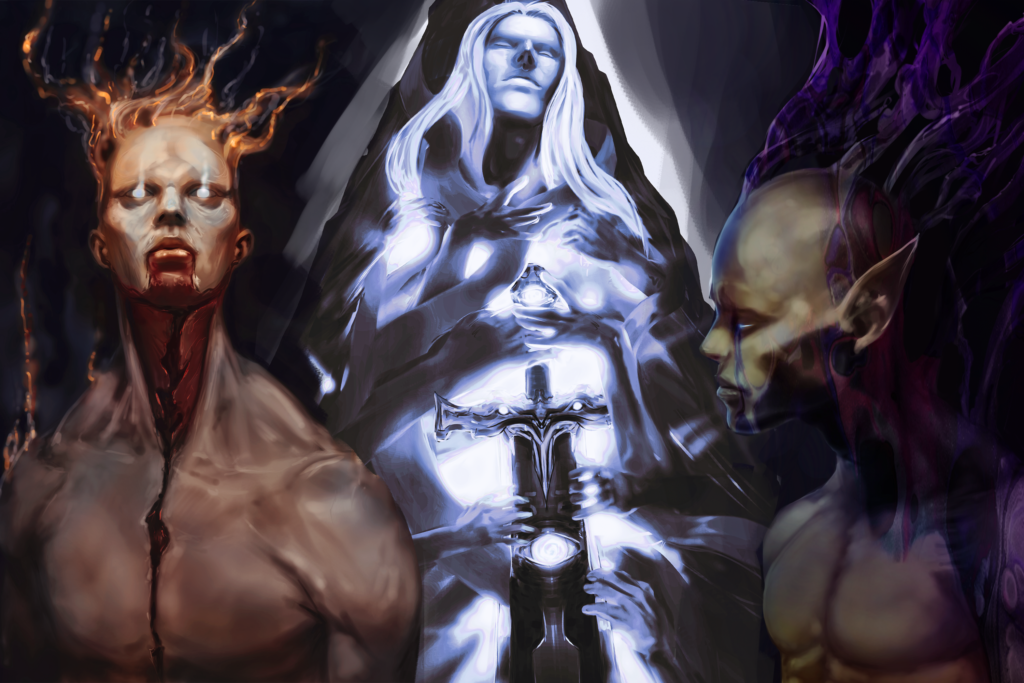
Eyes go to contrast first, always. Light subject on a dark background, or the reverse. Cluttered backgrounds kill this instantly, so keep the frame around your subject clean.
Color
Warm tones (red, orange, yellow) read as urgent and energetic. Cool tones (blue, green, purple) read as calm and intentional, this is closer to my own palette. Neon and saturated color cuts through dark-mode feeds especially well on TikTok.
Focal point
Rule of thirds still works. Put your subject or your text on one of the intersecting lines instead of dead center, it reads as more intentional and pulls the eye exactly where you want it.
What to actually do
- One subject, one focus. A close-up, a character, your face if it’s a tutorial. Don’t compete with yourself.
- Add a border or glow if the feed is busy, it separates your post from the noise around it.
- Text stays under 4 words. Bold, legible, done. “New Art Drop” beats a paragraph every time.
- Keep it consistent. Same color language and layout logic across your grid so people recognize your work before they read your name.
Common mistakes worth avoiding
- Overcrowding. One subject, real negative space, that’s the fix.
- Illegible fonts. Thin or overly decorative type disappears on mobile. Bold sans-serif wins every time.
- Skipping the mobile check. Almost everyone sees this on a phone. If it doesn’t read at that size, it doesn’t work.
Test it instead of guessing
Run two versions of the same thumbnail, different color or text placement, same everything else, and see which one actually pulls more clicks. YouTube analytics and Instagram insights both show you this directly, use them.
A strong click-through rate on YouTube generally sits above 5 to 10 percent. If you’re consistently under that, the thumbnail is the first thing to test, before you touch the content itself.
The SEO side nobody thinks about
- Write real alt text. Describe what’s actually in the image, keywords included, keep it short.
- Name the file properly. “dark-fantasy-character-thumbnail.jpg” beats “IMG4821.jpg” for search visibility.
- Compress before you upload. Under 1MB keeps load times fast, which search engines and viewers both reward.
The actual takeaway
A good thumbnail is a decision, not an afterthought. High contrast, one clear subject, consistent style, tested instead of guessed. Do those four things and your art finally gets the chance it deserves before anyone even sees the full piece.
What’s your thumbnail struggle right now? Tell me in the comments.